Onboarding, often referred to as a ‘warm welcome,’ is the first experience new users have with your product. Focus your onboarding on retaining new users — Google Material Design Guidelines
While planning for a new side project, I reviewed several well-known Android apps in the Google Play app store. These included Doodle, Todoist, Instacart, Mobills, Moovit, Slideshare and Runkeeper. Each handle onboarding, sign-up and sign-in in a similar way: they show me a splash screen and a sliding carousel of product highlights, then make me decide whether to log in with existing social identity credentials or use an email address. The latter—my personal favorite—requires choosing between signing up, signing in or resetting my password.
And then there’s Slack.
Slack reaches more than 5 million daily users and has a valuation over $5 billion (Forbes, Fortune). And, from personal experience, Slack is a must-have when attending Strange Loop! Soooo…
How does Slack do onboarding and authentication?
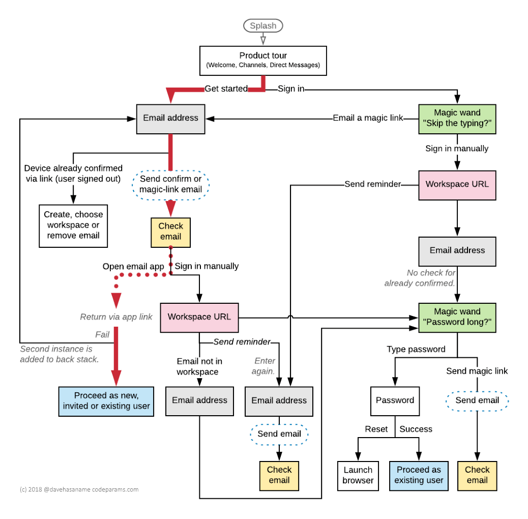
To understand that, you’re gonna need a flowchart!
Note that this informal diagram, which I created with Lucidchart, doesn’t represent what happens after confirming the email address—namely, create a workspace, enter a name and password and accept terms. It also doesn’t show other incoming app links for invites, workspace reminders and magic links. Lastly, it doesn’t represent back-button behavior.
Here are a half-dozen initial findings:
- Screens contain at most one input field.
- They don’t appear with borders like in traditional forms.
- The email address is verified right out of the gate.
- An app link in the confirmation email returns you to the app.
- The advanced “sign in manually” option is highly understated.
- You’d need to work hard to log in with a password.
Let’s take a closer look.
The thick red line indicates the ideal path along which the interface encourages new users to follow. It seems existing users find themselves on this route too by way of choosing “Sign In” and “Email me a magic link”. Either way, they’ll receive an email with the opportunity to proceed. So, is it necessary to have separate “Get Started” and “Sign In” buttons? Perhaps it is just more comforting for the user to specify that they’ve been here before.
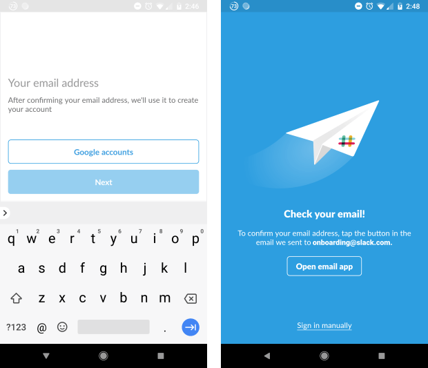
The isolated email prompt is followed by a convenient link to quickly pop open my email app, but I’m always reluctant to provide my gmail. I wonder if Slack could allow me to poke around and later ask for the missing info. With this, I would be less likely to use a disposable address.
As you scan the bottom of the flowchart, you’ll notice a couple additional “Check your email” screens. These, unlike the one along the main path, do not offer the same helpful button to open my email.
Another user-friendly button labeled “Google accounts” accompanies each of the email address prompts. I soon learned that this unassuming choice, lacking an icon and background, is actually for Google Sign-In. To me, this should follow Google’s branding guidelines or implement an account chooser using newChooseAccountIntent or CredentialPickerConfig.
Finally, a redundant step happens when I enter my address, request a workspace reminder and am asked again for my email. That aside, I’m curious about the need to ever type a workspace URL on the mobile app. After clicking the link, Slack could list all of my workspaces. Is this because it feels familiar to users who frequent the website with a browser?
I’m good at nitpicking, huh? 😀
- Should the onboarding carousel auto-rotate as Google recommends?
- Would Slack benefit from adding sign-in with Facebook?
- Are there cost or reliability concerns regarding such a heavy dependence on email?
What do you think?
Is Slack’s UX design truly user-friendly?


